Onboarding Journey
A fictional onboarding infographic in English, German, Arabic, and Japanese: built to show the real process of multilingual layout work, not just the result.
This brand and its content are entirely fictional, created to demonstrate a real DTP process without any confidentiality conflict.
01
Context and objective
Real multilingual DTP work almost never shows up in a portfolio as what it actually is. The real problem isn't "translating a paragraph," it's holding a visual hierarchy together when the target language takes up far more space than the original, far less, or reads in the opposite direction.
I chose a full-page onboarding infographic (a cover with a numbered index and six stages, each with a short name inside a fixed-width tag) because it's exactly the kind of piece where that problem becomes non-negotiable. With a fully invented brand and content, the goal was to publicly show this real technical challenge with zero confidentiality conflict, across four languages chosen deliberately for how differently each one breaks the template.
02
Process
Starting point: there were no editable files. The real reference material for this piece didn't arrive as a design package with text layers. It arrived as a final, flat PDF. The first step wasn't translation: it was rebuilding that PDF into an editable format, recreating the structure in clean segments ready for a CAT tool to process without breaking the formatting.
Preparing for the CAT tool. Every label, heading, and text block is isolated as its own segment: if text gets mixed in with decorative elements, the CAT tool processes it badly and the error carries through to every output language.
Rebuilding per language, respecting the hierarchy. Once translated, the text comes back with completely different lengths and reading directions. The real DTP work is rebuilding the piece so each label fits its space without breaking the visual hierarchy, keeping the same reading order in every version (what's read first, what's the title) even when the language completely changes the direction or the typeface.
A deliberate choice of contrasting languages. German for expansion in short labels; Arabic for a different structural challenge (reading direction); Japanese for a third problem, where the brand typeface itself stops working.
03
Key decisions
Measure real expansion, don't assume it. "Meet the Team" (13 characters) becomes "Das Team kennenlernen" in German (21 characters). It doesn't fit the same space. For that label, the fix was splitting it into two lines inside the same box; for another with a similar problem ("Unternehmen entdecken"), reducing the type size was enough. The choice isn't aesthetic. It depends on how much real margin each specific label has.
Arabic: a full mirror, not just right-alignment. Each stage's number moves to the right side of its row, the cover's index moves to the left side, and the reading order of every element reverses so the narrative logic (Day 1 → Month 12) still reads correctly.
Japanese: when the problem isn't space, it's the typeface. The title typeface used across the rest of the piece has no Japanese glyphs. It's not a matter of size, it simply can't represent those characters. It had to be replaced with one that supports CJK, and line height had to increase (160–180%, versus ~104% in English). And unlike German, the Japanese labels ended up shorter than the original: not every language expands.
04
Final solution
The same infographic, in four versions, each solved with the specific strategy its language demanded.
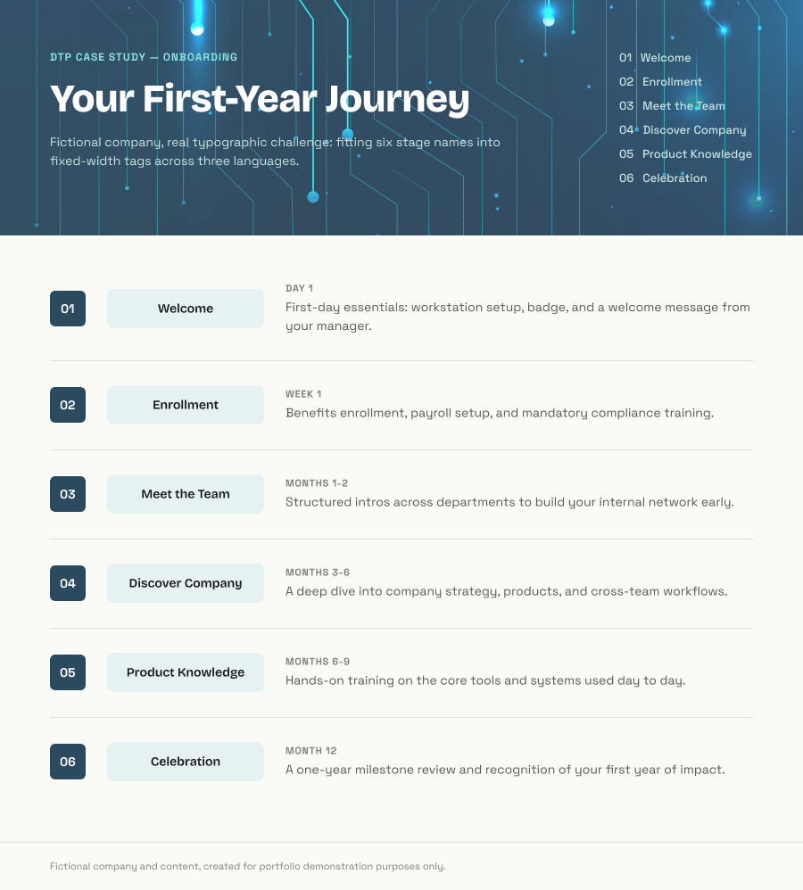
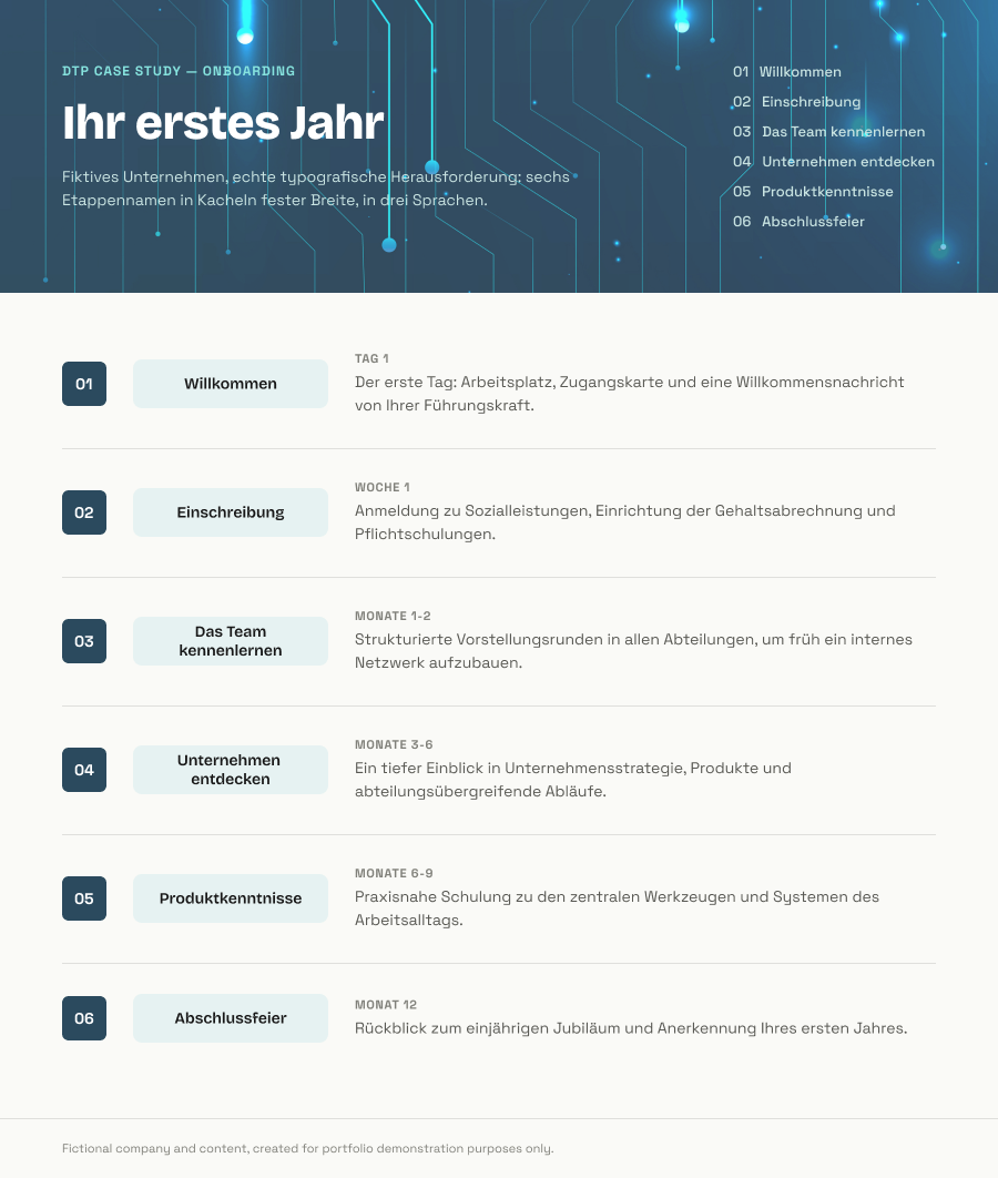
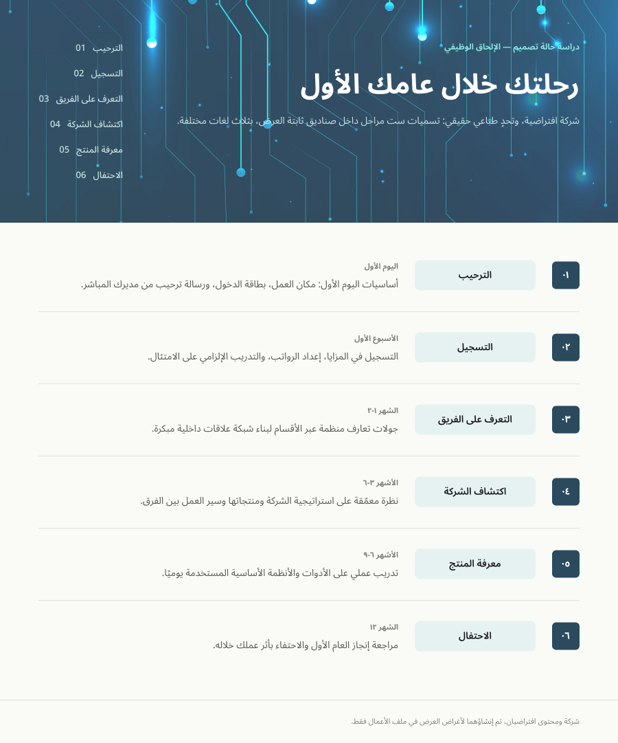
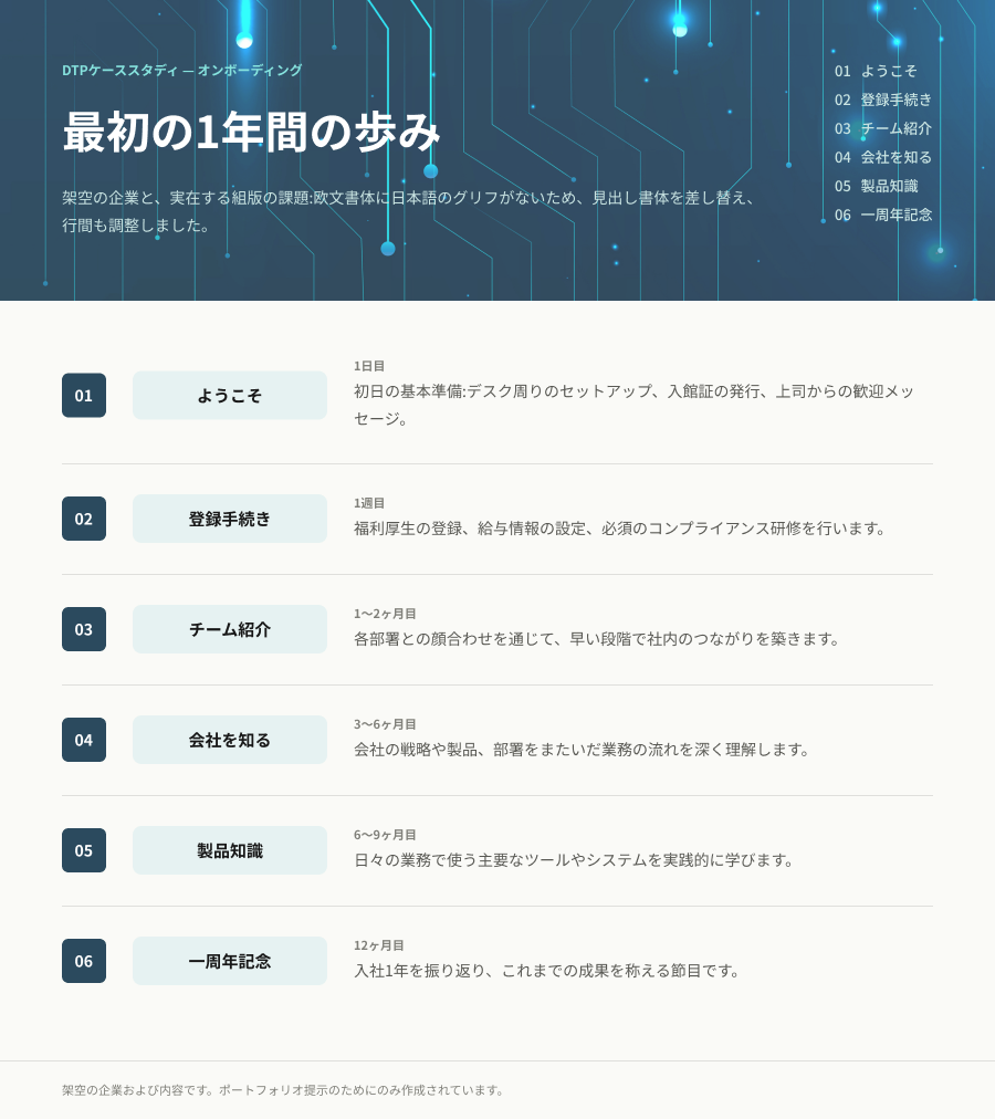
Why four languages: each one breaks the template in a different way (expansion, reading direction, and typeface substitution) so together they cover most of the real problems in a multilingual project.
05
Learning
A language's average expansion says nothing about the real breaking point. You have to check label by label in fixed-layout elements; sometimes the language doesn't expand, it contracts.
Reading direction is a design problem, not a language problem. Adapting to RTL means rethinking the entire visual order of the information, not just mirroring the layout.
Not every multilingual problem is about space. Sometimes the chosen typeface simply can't display the target language, and it has to be solved at the type-system level.