Solstice Capital
An explainer e-book on investment strategies, with a fully fictional brand and content, in English, French, and Spanish.
"Solstice Capital" is not a real company. Brand, products, and content are entirely fictional, created to demonstrate a real DTP process without any confidentiality conflict.
01
Context and objective
Not all multilingual DTP work starts from the same place. Sometimes the client hands over a flat PDF that has to be rebuilt from scratch; other times a native InDesign package, already set up with layers, grid, and paragraph styles. I wanted a second DTP piece showing this second scenario. An explainer e-book for an investment strategy (brand, products, and content fully invented: "Solstice Capital"), combining six sections with different layout registers: a conceptual diagram, a step-by-step process, a comparison with a repeated header, a list of considerations, a product card grid, and a page of dense legal text.
With a fully invented brand, products, and content, the goal was to publicly demonstrate a type of work (regulated financial documentation) that in real practice is always covered by confidentiality: that the same template system holds up across three languages with very different profiles (English, French, and Spanish) without breaking in any of the six sections.
02
Process
Starting point: a native InDesign package. Unlike other projects where the source file is a PDF that has to be rebuilt, here we start from an already-assembled package with everything needed to work directly. The challenge wasn't rebuilding the structure: it was that the content decisions made while translating considerably increased the length of specific blocks, and each one had to be adjusted individually based on how much real margin it had.
Measure the container, not just the language. The cover title went from two lines in English to three in French. But the full-width section header ("Underlying Investment Profile" → a noticeably longer phrase in French) absorbed that same expansion in a single line, without breaking: a full-width block tolerates language variation far better than a small, fixed-width tag.
A product grid with flexible height. The product cards were designed with flexible height, not a fixed pixel value, and cards in the same row always match the tallest one. When translated, one description grew long enough to make its card taller; the rest of the row adjusted automatically.
Even the characters' names get localized. The illustrative characters in the concept diagram are renamed in every language: Maya and Devon in English, Manon and Étienne in French, Marisol and Tomás in Spanish.
03
Key decisions
Container width determines how much variation it can absorb. Measuring "how much this language expands" isn't the same as measuring "how much this language expands inside this specific container." The same header, in a full-width band, survives a considerably longer translation with zero adjustment; the same length of text, inside a small fixed-width tag, breaks the design.
The disclaimers page expands less, and for a different reason. While headings and short labels expand noticeably, the legal page barely changed size, because it's dense, continuous prose, not short labels. A language's average expansion depends on the type of text, not a fixed number.
Three languages, not two. Adding Spanish (alongside English and French) confirmed that the same template holds up with a third, distinct expansion profile, without adding a single exception to the system.
04
Final solution
A seven-piece e-book (a cover with an index and six sections) in English, French, and Spanish. These are the two sections where the translation problem shows most clearly.
Cover
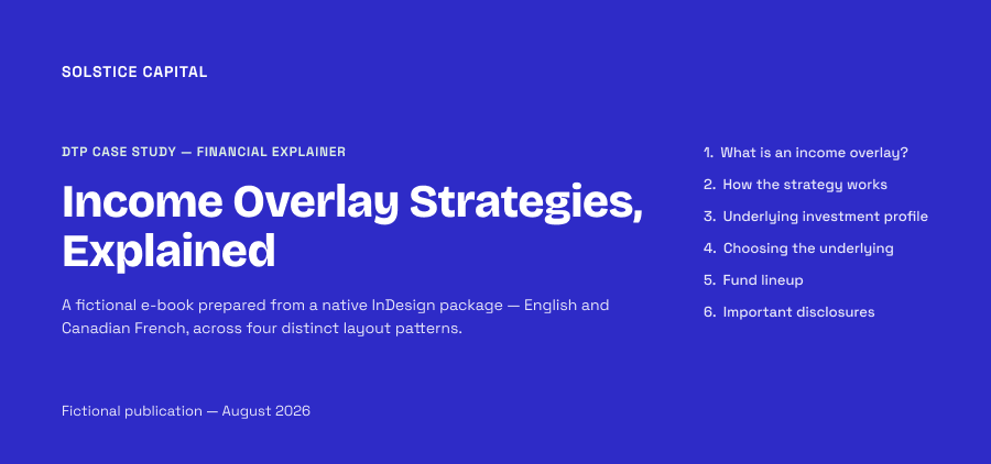
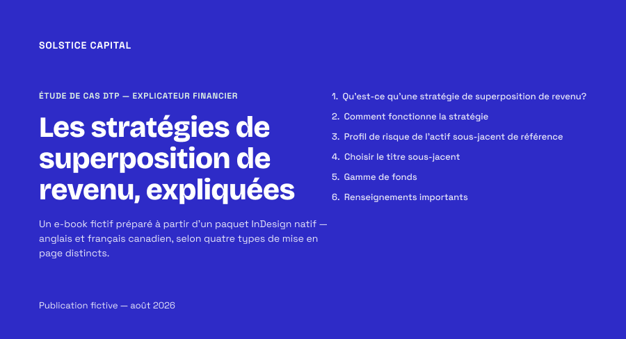
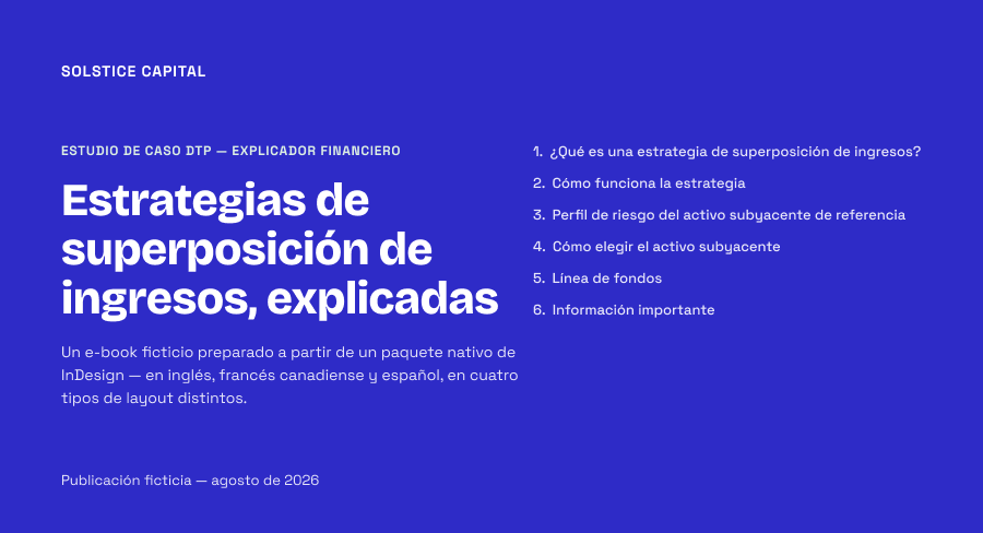
Why it matters: it's the piece's first proof of expansion: the same title goes from two to three lines in French, without breaking the cover.
Underlying investment risk profile
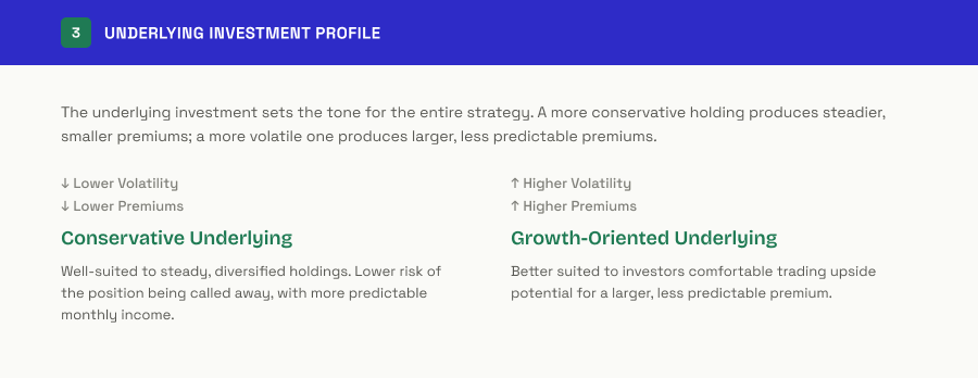
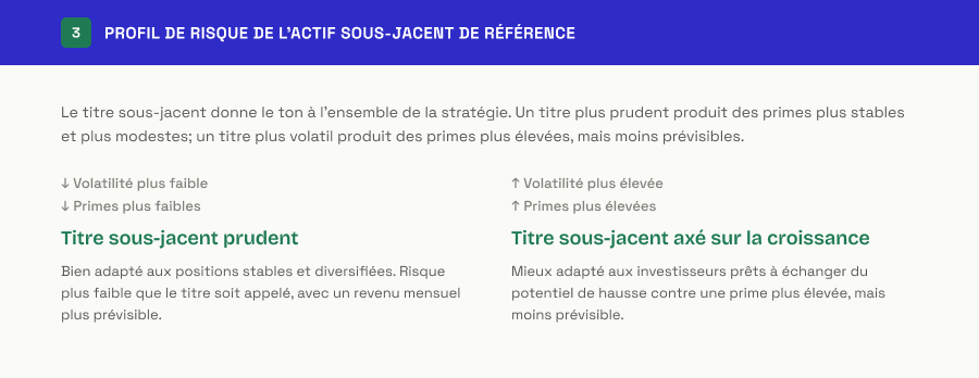
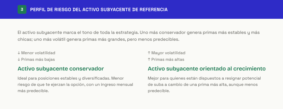
Why it changed: the repeated header ("Underlying Investment Profile") is much longer in French, and because it lives in a full-width band, it absorbs that expansion in a single line, with no adjustments.
Fund lineup
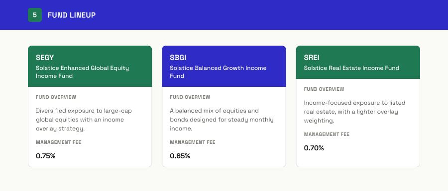
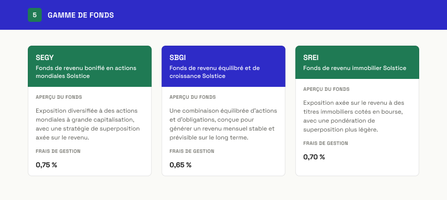
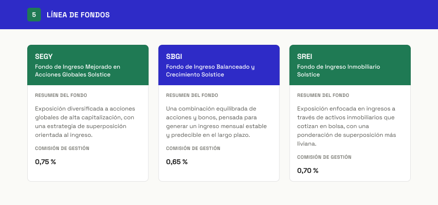
Why it changed: one fund's description grew when translated, and that card grew taller. The rest of the row adjusted automatically to stay aligned, with no manual re-layout.
05
Learning
The source file's origin changes the process, not just the starting point. Working from a native InDesign package is a different kind of problem than rebuilding a flat PDF. Both are a real part of the craft.
Container width matters as much as the language. Before deciding how to solve an expansion, you have to look at what kind of space that text lives in.
A well-designed template tolerates content variation without manual intervention. The real value of a layout system isn't how it looks in the original language: it's how much manual work it saves when the content changes, even when that change is an editorial decision, not just a literal translation.