Poniente
I redesigned a 2021 project with the judgment I have today: weather, community, and surf in a single app.
01
Context and objective
Poniente is a weather and community app for ocean sports (mainly surfing) that I originally designed in 2021, during a UX/UI course at Coderhouse: research, user archetypes, a sitemap, usability testing with 6 participants, and a navigable 51-screen prototype in Adobe XD.
Five years later, with additional training in editorial design, I looked at that project again with different eyes and found problems I couldn't see back then: a social section with no clear purpose, a conditions score with no context, a flat visual hierarchy. I worked on this redesign as a portfolio piece. The goal wasn't just to "update the visuals," but to demonstrate judgment: show how I'd improve it today, and why, in a way a recruiter can follow the reasoning behind.
My DTP background naturally led me to explore digital product design, where the same principles of hierarchy, clarity and accessibility apply in a different context.
02
Process
Critical review of the original project. I analyzed the screens and the original Behance case study, plus the Adobe XD prototype, looking specifically for: which decisions had no clear justification, which visual patterns felt dated, and which UX problems went unresolved at the time.
What I keep from the original 2021 process. Not every part of that process deserves the same spotlight. Some of it (generic archetypes, benchmarking with no clear takeaway) is exactly what this redesign questions. But two pieces do carry the weight of a real process, and are worth showing:
- Real usability testing: 6 participants, moderated both in person and remotely, with concrete findings that shaped decisions (which core features were self-explanatory, what created friction).
- Sitemap and user flow: the original project's information architecture and navigation flow already showed a solid grasp of how the screens connect, beyond how they looked.
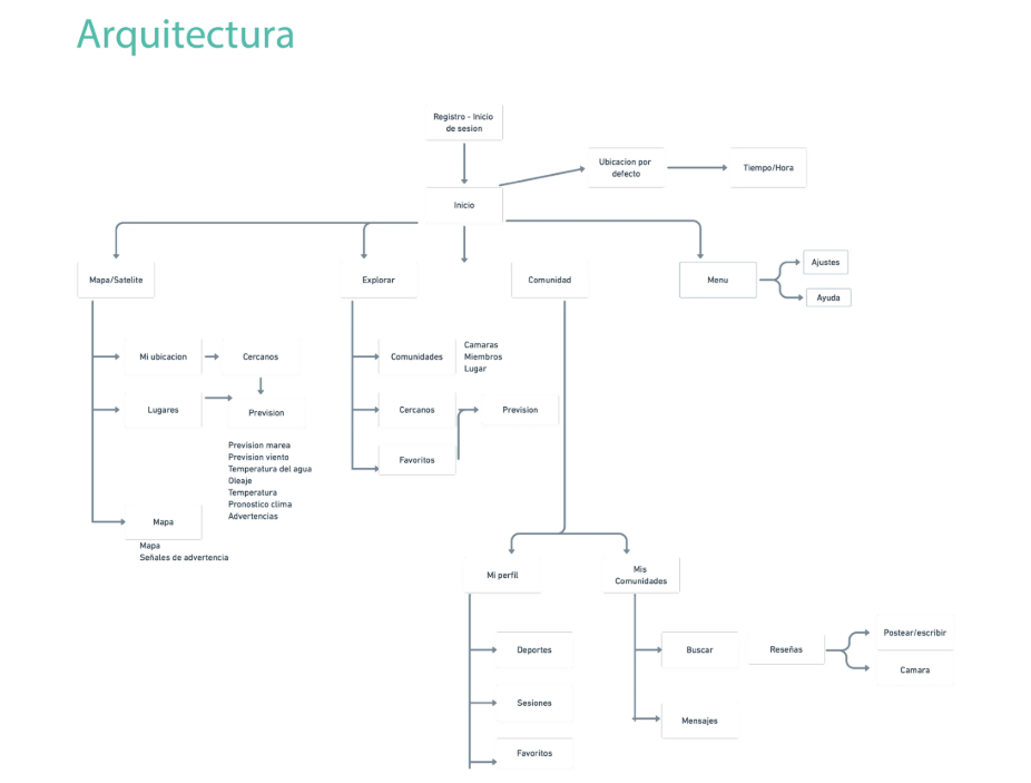
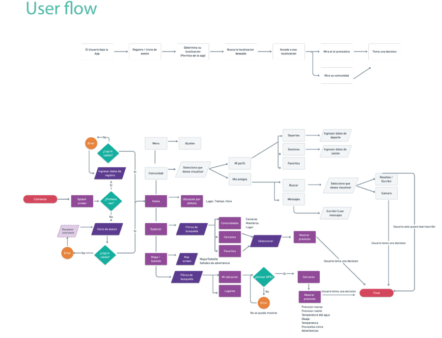
The rest of the original process (archetypes, benchmarking, low-fidelity wireframes) stays as brief context, not the main event. It's exactly the kind of detail that in 2021 carried the same weight as everything else, and that I now know how to prioritize.
Identifying concrete problems:
- The "People" section (social-network-style profiles) had no clear connection to the rest of the app.
- The conditions score ("4.3/5 ★★★★☆") appeared with no explanation of what it measured.
- User archetypes were generic, with no visible link to later design decisions.
- Flat typographic hierarchy: the whole case study carried the same visual weight, with nothing to guide the eye.
- Visually dated elements (decorative illustrations with no function, a Twitter icon for a platform that no longer exists under that name, a muted palette).
- A contrast problem on the Explore screen (gray text on a light gray background in the spot descriptions), something I'd catch today in any basic accessibility audit and that went unnoticed in 2021.
Defining the new core concept. Based on those problems, I defined "community by spot" as the redesign's throughline: instead of a generic social network, the social feature lives inside each place: who's a regular there, who's going today. That gives the piece a clear purpose it was missing in 2021.
A structured decision process. Before touching Figma, I worked out the content and logic of the 5 screens through questions and answers: what data goes on each screen, what states it has, what happens when there's nothing to show. This kept me from visually redesigning unresolved underlying problems.
Visual direction. I defined a palette with a clear rule for meaning (cool tones for nature/weather, warm tones for community/social), typography with more character (Poppins for headings, Inter for data), and built the system in Figma.
Interactive prototype. I built the 5 screens with real interactions: horizontal scroll on the tide chart (with 4 navigable states), horizontal scroll on spot lists, full-page vertical scroll, and connected navigation across all screens.
03
Key decisions
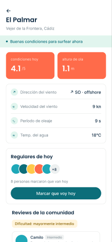
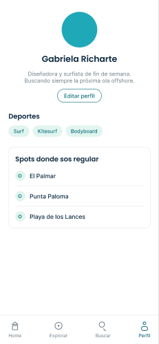
Community by spot, not a separate social network. "Regulars at this spot" and "who's checked in today," with an automatic reset at midnight.
The verdict is stated in words, not just a number. "Optimal surf conditions today" instead of a score with no context.
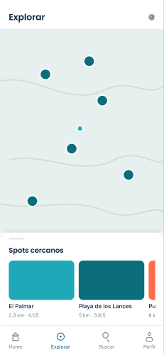
Map with neutral pins. They don't change color based on conditions. This keeps the map from turning into a confusing traffic light.
A complete alert system, not just the happy path. Red, yellow, and a community notice, with a real example of how the Home screen rearranges itself.
04
Final solution
Five connected screens in a navigable prototype: Login, Home, Spot detail, Explore, and Profile.
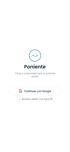
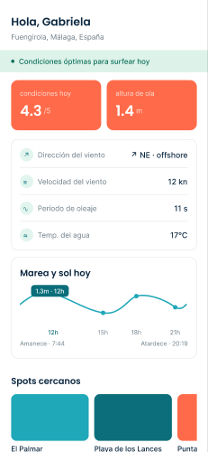
Login
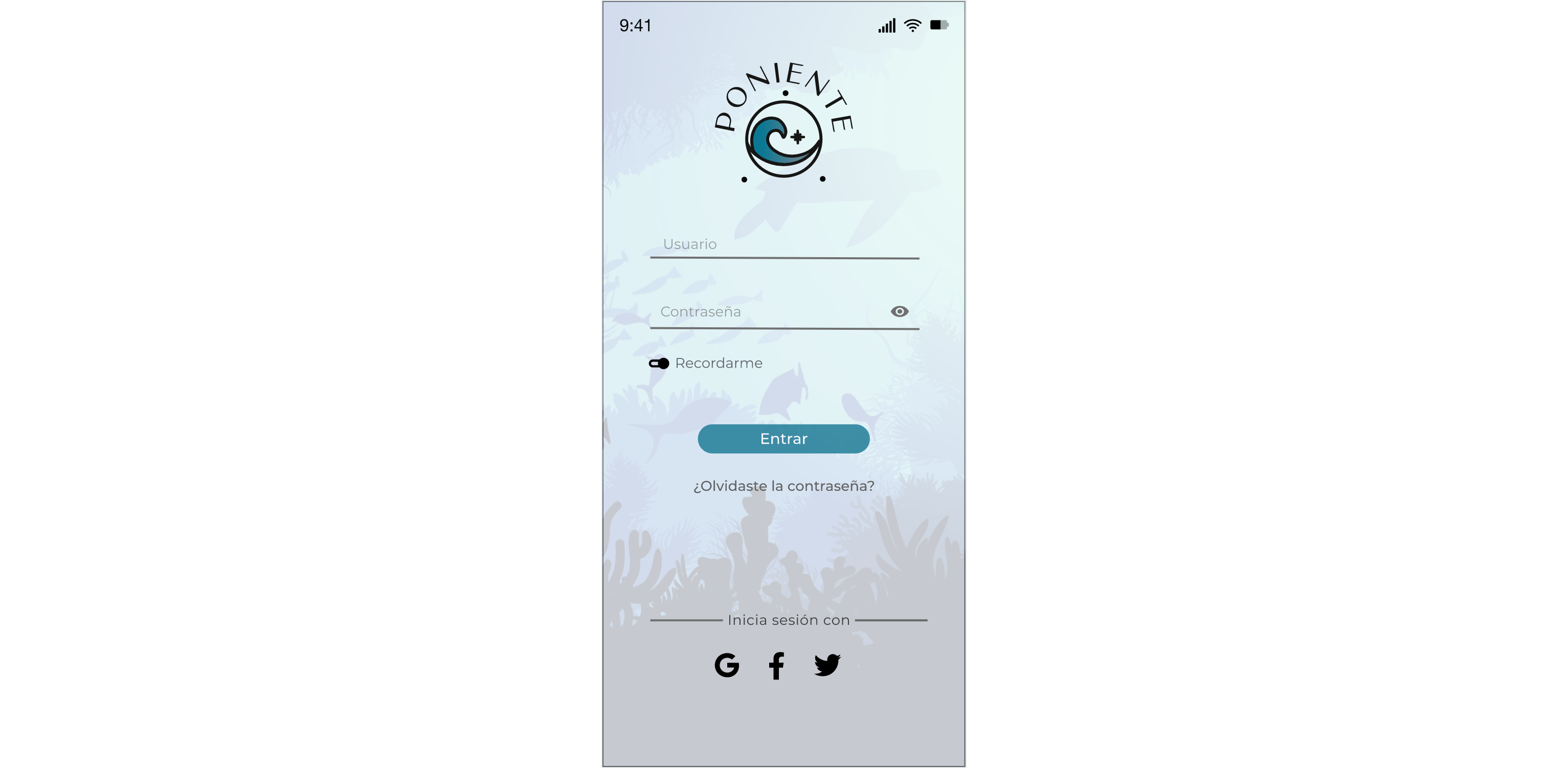
Why it changed: less friction, less upkeep of obsolete options, more honesty about what information is actually needed to log in.
Home
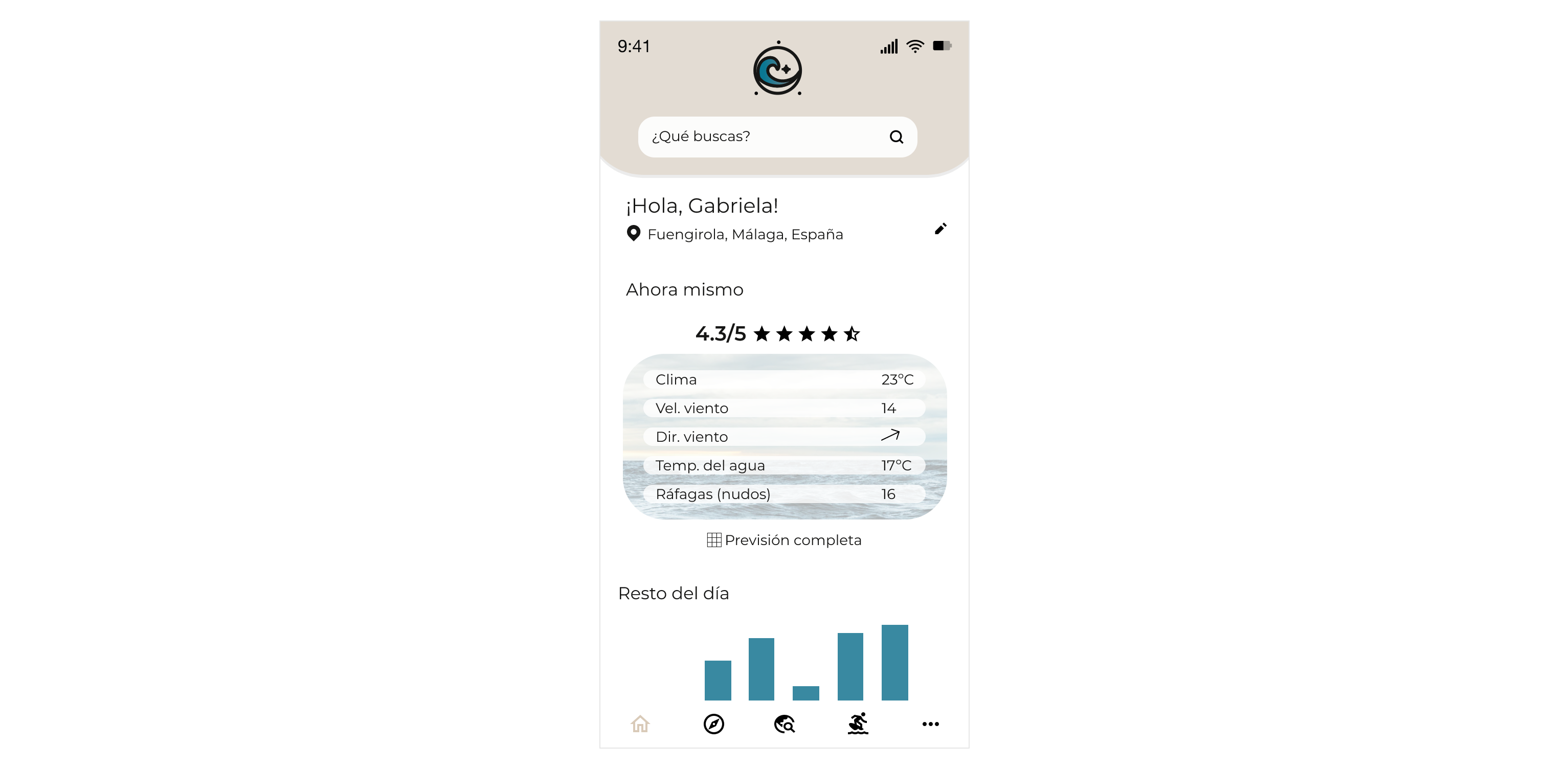
Why it changed: a data point with no context isn't information, it's noise. The redesign prioritizes letting the user understand the day's conditions in two seconds.
Explore (previously separate "Explore" + "People")
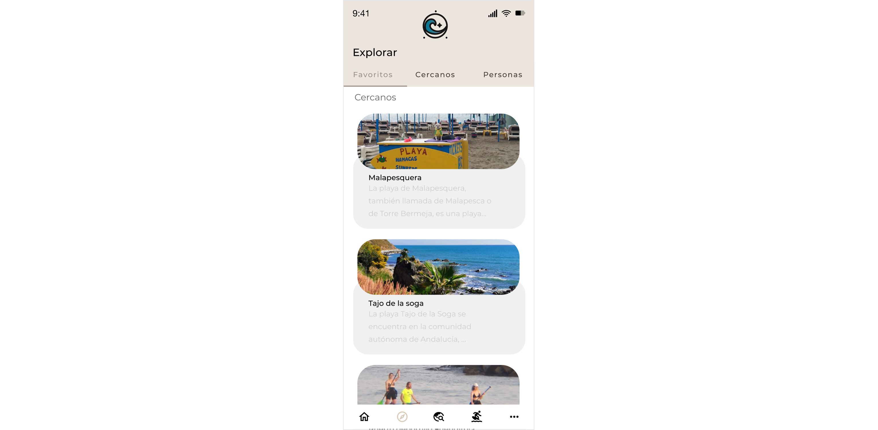
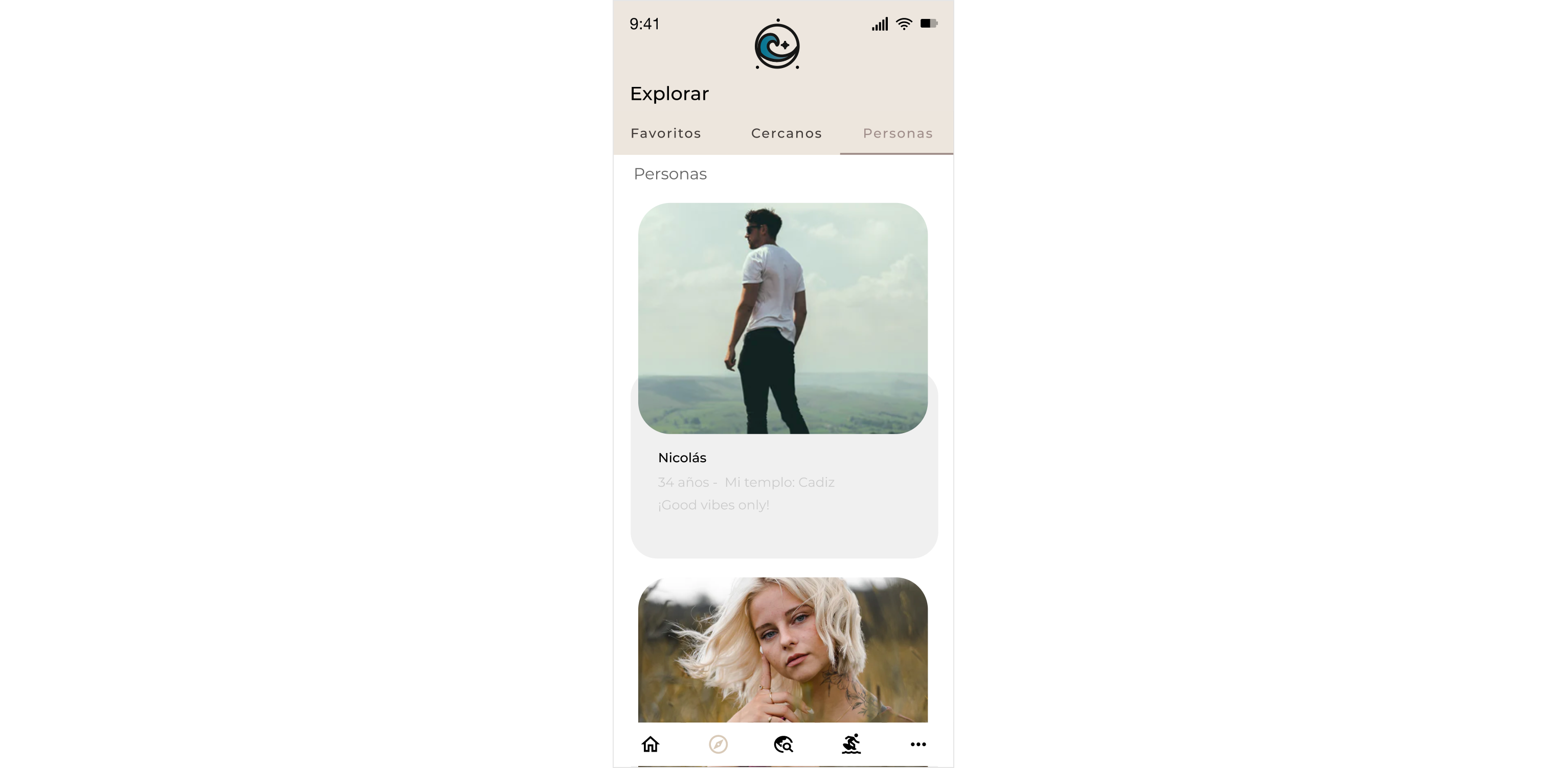
Why it changed: it resolves the underlying problem at its root (a social feature with no clear purpose) with the "community by spot" logic that the whole redesign rests on.
05
Result and learning
This project doesn't measure real business outcomes. It's a critical-review exercise. Its value is in showing how my design judgment has changed in five years.
Questioning a number with no context matters as much as designing it. The "4.3/5" from 2021 wasn't poorly executed. It was poorly thought through.
My editorial background changes how I design interfaces. Typographic hierarchy and visual rhythm come directly from years of laying out editorial content.